How Satirical Protest Designs Turn Anger into Art and Action
I remember the first time I saw a protest sign that actually made me laugh out loud. It was at a climate march in 2019, and someone had repurposed a fast-food logo into a dripping skull. The message was clear, but the delivery was unexpected. That moment stuck with me because it showed how humor can break through the noise of a crowded rally. Satirical protest designs are not just clever slogans on cardboard. They represent a long tradition of using wit and visual disruption to challenge power. When done well, they make you think, then they make you act.
The Roots of Visual Dissent
Satire in protest is not new. The political cartoon has been a staple of dissent for centuries, from the etchings of William Hogarth to the sharp commentary of modern artists like Molly Crabapple. What changed in the late 20th century was the scale and the medium. With the rise of street art, pop art, and culture jamming, activists began turning public spaces into galleries of resistance. The peace symbol, originally designed for the British nuclear disarmament movement, became one of the most enduring graphics in history. It worked because it was simple, memorable, and could be reproduced anywhere.
By the 1990s, a new wave of artists started blending advertising techniques with political messages. Shepard Fairey, best known for Obey Giant, used the visual language of propaganda to create a playful but pointed critique of authority. His work showed that a well-designed image could travel faster than any news article. Banksy took this further by stenciling darkly comic scenes onto walls in contested spaces, turning street art into a global conversation about war, surveillance, and inequality. These artists understood that to reach people who tune out political speeches, you have to make them stop and look.
Détournement and the Art of Subversion
One of the most powerful techniques behind satirical protest designs is détournement, a concept from the Situationist International that means turning mainstream media against itself. The idea is to hijack familiar images and slogans and twist them to reveal hidden truths. This is exactly what Adbusters has done for decades with their magazine, remixing corporate ads into biting commentaries on consumerism and militarism. Their work inspired the Occupy movement's use of the "99%" slogan, which was simple, inclusive, and devastatingly effective.
Subvertising takes this same approach into the real world. Activists alter bus stop ads, billboards, and subway posters to expose corporate hypocrisy. The Yes Men famously impersonated corporate spokespeople to mock the logic of deregulation and environmental destruction. Their stunts were theatrical, but the underlying strategy was pure détournement: take the tools of the powerful and use them to tell a different story. I have seen this technique work in small towns and big cities, where a single altered billboard can become a local legend that sparks weeks of conversation.
From T-Shirt Cannons to Ironic Branding
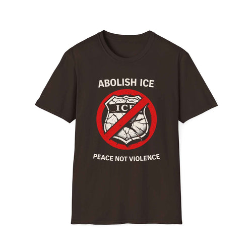
Clothing has always been a canvas for satire. Protest t-shirts let people carry a message with them everywhere, turning every street corner into a potential rally. The challenge is making a design that works on fabric, where the viewer has only a few seconds to get the joke. That is where ironic branding comes in. By mimicking the look of a corporate logo or a military insignia, designers can create a visual punchline that lands instantly. Some groups have even used t-shirt cannons at rallies to distribute satirical protest designs to the crowd, turning the act of giving away shirts into a performance.
The Guerilla Girls took a different approach. They used bold typography and anonymous gorilla masks to call out sexism and racism in the art world. Their posters were simple, factual, and devastating. They did not need elaborate graphics because the numbers spoke for themselves. Their work reminds us that satire does not always have to be funny. It can be ironic, uncomfortable, or even confrontational. The key is that it makes the audience question what they normally accept as normal.
Sign puns are another favorite tool of activist designers. A well-placed pun can make a complex issue feel immediate and personal. I once saw a sign at a housing rights march that read "Eviction is a crime" with the word "crime" written in the style of a police badge. It took three seconds to get, but it stayed with me for days. That is the power of visual shorthand. When you combine that with a strong graphic, you get something that can travel online, on the news, and on the streets.
Anarcho-Typo and the Aesthetics of Resistance
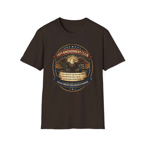
Typography itself can be a form of protest. Anarcho-typo, a term used to describe the visual language of radical movements, often uses bold sans-serif fonts, high contrast, and a deliberate roughness. This style rejects the polished look of corporate design in favor of something that feels handmade and urgent. It is no coincidence that the most iconic protest signs from the last decade look like they were screen-printed in a basement rather than designed in a studio. That roughness signals authenticity. It says, "I made this because I had to."
Billboard liberation takes this aesthetic into public space. Groups like the Billboard Liberation Front have been altering outdoor ads since the 1970s, turning corporate messages into subversive art. Their work is illegal, temporary, and often hilarious. But it also demonstrates a key insight: the most effective satirical protest designs are not just about the message, they are about the medium. By subverting the very formats we are used to seeing ads in, they break the spell of commercial culture.
Making Satire Work Without Crossing the Line
Satire in protest is not without risks. It can alienate people who do not get the joke, or it can be mistaken for endorsement. There is a fine line between a clever sign and one that feels mean-spirited. The best practitioners, like the artists at Ronin, understand that the target must be the system, not the people caught in it. When satire punches down, it loses its power. When it punches up, it becomes a tool for solidarity.
Timing also matters. A joke that works at a rally in June might fall flat in November. The political landscape shifts, and so must the designs. That is why the most effective activist apparel brands release new designs in response to current events. They know that a static message will not hold attention. The best satirical protest designs are reactive, nimble, and deeply aware of the moment they are speaking to.
The Future of Visual Dissent
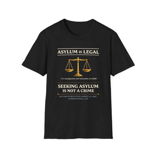
As the tools of graphic design become more accessible, the barrier to entry for satirical protest continues to drop. Anyone with a smartphone and a free editing app can create a sign that could go viral. But the proliferation of images also means that the signal-to-noise ratio is worse than ever. Standing out requires more than just a good idea. It requires understanding the visual language of your audience, knowing when to be subtle and when to be loud.
The most memorable protest art I have seen in recent years was a simple sticker of a cartoon figure holding a sign that read "I can't believe I still have to protest this." It was self-deprecating, weary, and funny all at once. It captured the exhaustion of activism without giving up the fight. That balance is what makes satirical protest designs so powerful. They let us laugh at the absurdity of the situation without losing sight of why we are angry. And in a world where anger is easy but action is hard, that laughter might be the thing that keeps us going.